Regional Analysis 1901-2015
Station Coverage
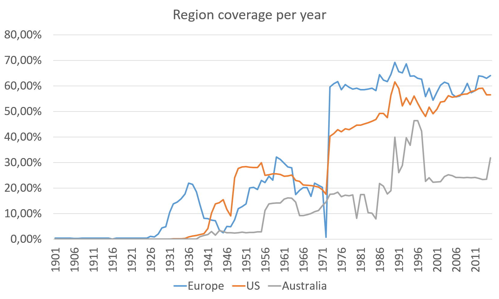
The percentage of area covered by station for each region
After analyzing the full station location map, we decided to focus on the three most promising areas in terms of data quantity and quality. From the chart it's clear that we still don't have enough stations for a complete and uniform coverage of the three areas. To analyze the data we divided the region in small areas of 1° latitude per 1° longitude. With a more relaxed suddivision we could have a higher area coverage, but at same time we would have less precision, because that would put togheter geographical positions further away from each other.

Region Averages
The average value of the temperature in the last century for Europe, US and Australia
Temperature increase around the world but also in large regions is usually very small and difficult to detect. The main problem are the instruments we use and the total amount of data available. To create a reliable map of wheather change in the last 100 years is very difficult for this reason. Then again, when can we be sure to have enough data to draw conclusion on this phenomenon? Not many researchers are actively trying to answer this question at the moment, and the reason is that the quantity of data we can use is increasing during the years. Indeed, from the average chart, we can see a stabilization of data in the last fifty years. Another interesting pattern, that is confirmed by independent observation made from other datasets, is that the average temperature of the US area was recently slighly decreasing, while in the European and Australian ones we can notice a stedy increse due to global warming.
EU Stations
The number of stations that cover the European area from 1901 to 2015
We can notice two different drops in the number of stations: during the early 40s (correspondig with the WW2 period) and in the year 1972. While the origin of this is unknown, analyzing the data may help in understanding what happened during those years. For instance, in 1972, we have no data from areas like Italy, the balkans, east Europe and Russia. As we can see from the picture, just 4 years before, in 1968 we had data from many stations in this area.
Stations in 1968

Stations in 1972

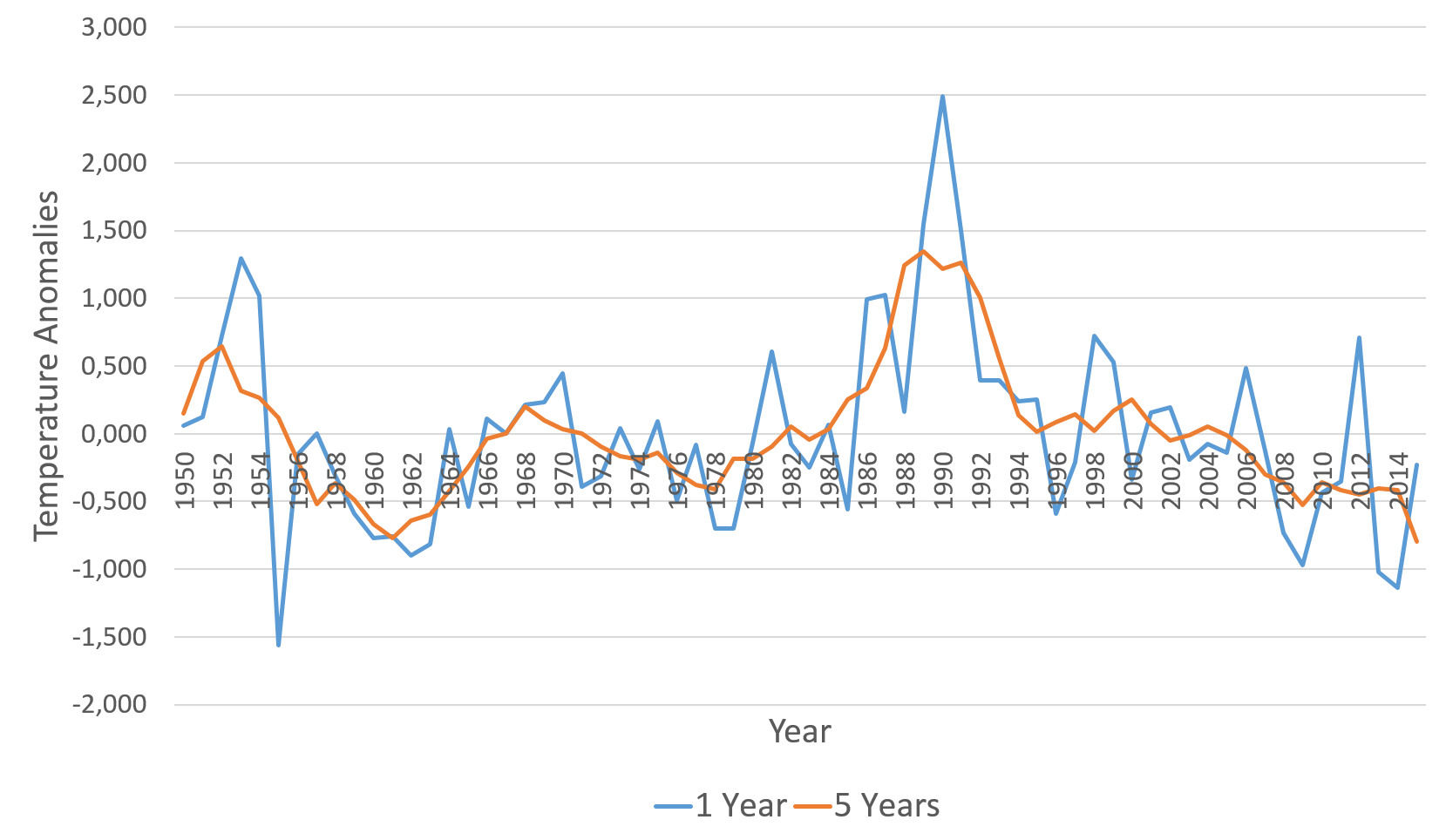
EU Anomalies
European temperature anomalies from 1901 to 2015
Two things appear evident from this chart: the warming of the European region starting around 1980 and a downwards trend in the time frame 1950-1980. Interesting to note that the 5-year average didn't fluctuate much even considering the limited amount of data of the earlier data sets.
US Stations
The number of stations that cover the United States from 1931 to 2015
As we can see from the chart, the period of time for which we have more data (and thus more reliable results) is the one that goes from 1973 to today.
US Stations
Temperature anomalies in the states from 1931 to 2015
The calculated averages of the region for the chosen period show mostly little changes during the years, especially considering the five year averages. This pattern is broken by a temperature spike we revealed around 1990. We need to inspect more the data to understand the causes. We suspect it may be either a different distribution of stations compared to the surrounding years or the presence of corrupt data.
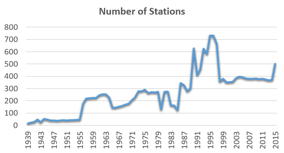
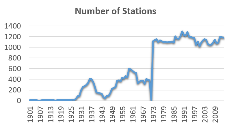
AU Stations
The number of stations that cover Australia from 1939 to 2015
We stated before that the availability of data is set to increase as time passes, due to technological improvemets. What we can see from this chart is that the opposite phenomenon happened, since in the last ten years we have less data that in the years before. At the moment we have no clue about what happened in the late 90s to cause this. If we hat to take a guess, we think that a mass dismission of old stations was decided t that time. To verify this, we could take a look at the lifespan of the station in that area and correlate the data.
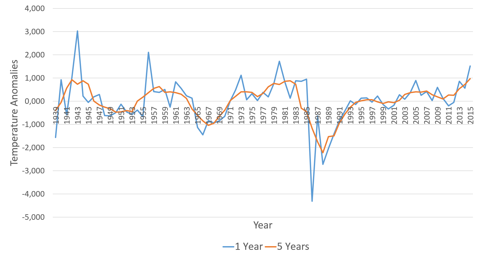
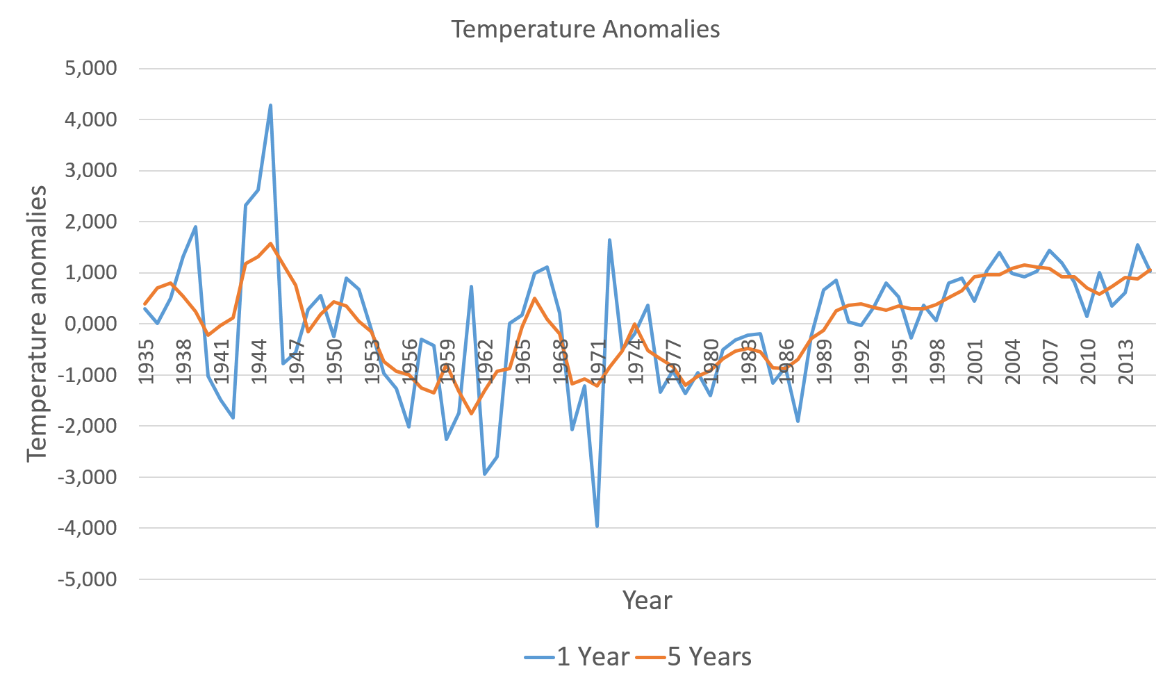
AU Anomalies
Australians temperature anomalies from 1939 to 2015
Analyzing the data from the Australian region we notice a large amount of one year temperature spikes and dips, suggesting that there are events that have great influence in the region's weather (e.g. hurricanes). Another interesting point to notice is the late 80s period where we noticed that the average temperature is surprisingly low. Analyzing the data source we found that stations reported as correct temperature values of ~-70°C in the south west of Australia (where the lowest reported minimum found is -23°C).
Copyright © Your Website 2014